Vivian's Design Project
Micro-SaaS PDF Tool
Full Case Study
UX/UI design
SaaS
My Role
Product Strategist, UX/UI Designer, Webflow Developer
Duration
Mar - Apr 2025
Tools
Figma, Webflow
Why am I doing this project?
I was invited to be the designer of this project by a developer friend who noticed a clear gap in the market: most PDF filling tools are not accessible enough and make even simple tasks frustrating. Together, we set out to design a tool that allows anyone to quickly and easily fill out PDFs - no downloads, no tedious editing, and a seamless experience across devices.
Table of Content
Introduction
Designed and developed a Micro-SaaS tool that instantly converts static PDF forms into interactive web forms, making it effortless for both individuals and businesses to collect and manage responses. Led the entire product lifecycle from market research and UX/UI design to launching a Webflow marketing site.
PDFkuai is a dual-purpose web tool that transforms any PDF into a smart, fillable web form in seconds. Designed for both personal and business use, it eliminates the need for manual editing, endless zooming, or complex setup. Users can fill, sign, and submit forms online—no account required for individuals, and a powerful dashboard for teams.
The Problem 🛑
Most existing PDF form tools are bloated, locked behind paywalls, and poorly optimized for mobile. For users who just want a quick and easy way to convert, fill, and share PDFs—especially on the go—these tools are overkill. They often require sign-ups, paid subscriptions, or clunky desktop interfaces that don't adapt well to modern workflows.
My Solution ✅
We set out to build a lightweight, mobile-friendly tool with a freemium model that makes PDF form conversion fast, intuitive, and accessible to everyone. No logins, no clutter—just upload, convert, and share in seconds, whether you're on a desktop or your phone.
Empathizing

Inspiration

The idea behind PDFku.ai began with a real frustration. Chan, the developer and founder, found himself repeatedly needing to fill out and collect PDF forms across a range of life admin tasks—real estate documents, immigration paperwork, rental agreements. These use cases had one thing in common: the process was unnecessarily painful.

Competitive Analysis

To better understand the broader problem, we explored how users currently navigate PDF workflows. We discovered that most tools fell into one of two categories:

  • Professional-grade tools like Adobe Acrobat were too heavy and required subscriptions just to fill or edit basic fields.
  • Free browser tools were often unreliable, had clunky interfaces, or didn’t support mobile at all.

Competitors on mobile

Competitor's editor interfaces

Analysis on competitors

🔍 Opportunity Summary for PDFku.ai

Our competitive analysis revealed several gaps in existing PDF form tools, opening up clear opportunities for differentiation:

Affinity map of analysis findings

From this research, we defined a core insight: users don’t want a "platform" - they want a quick, clean tool that works without extra setup. This shaped our MVP to focus on minimal onboarding, mobile accessibility, and free-to-use functionality.

Ideating

Product Strategy and User Segmentation

Before strategizing on product roadmaps and MVP scoping, we defined our users and use cases.

Who are the users?

  • Individuals (2C): students, freelancers, job seekers, etc.
  • Businesses (2B): HR, leasing offices, tax/immigration consultants, etc.

Common use cases: Tax forms, lease applications, HR onboarding, immigration docs, etc.

With a clear understanding of user pain points, We moved into product positioning. We recognized two distinct user groups:

User Groups: 2C and 2B

Creating personas is a critical step in aligning product decisions with real user needs. By clearly defining representative users like Mark and Sasha, I was able to ground our design and feature priorities in real-world contexts - balancing the simplicity needed by on-the-go individuals with the structure and scalability required by business teams. These personas helped me avoid designing in a vacuum and ensured that every decision from MVP scoping to UI layout was purpose-driven and user-centered.

Mark, the business persona

Sasha, the customer persona

This strategic split allowed us to maintain the clean experience consumers expect, while planning for business-facing features like team collaboration, analytics, and custom branding in the future.

We also mapped our competitive positioning:

  • Compete with Adobe-like products by offering a mobile-first experience
  • Compete with JotForm by simplifying the flow to just 3 steps & a more affordable pricing to capture freemium users

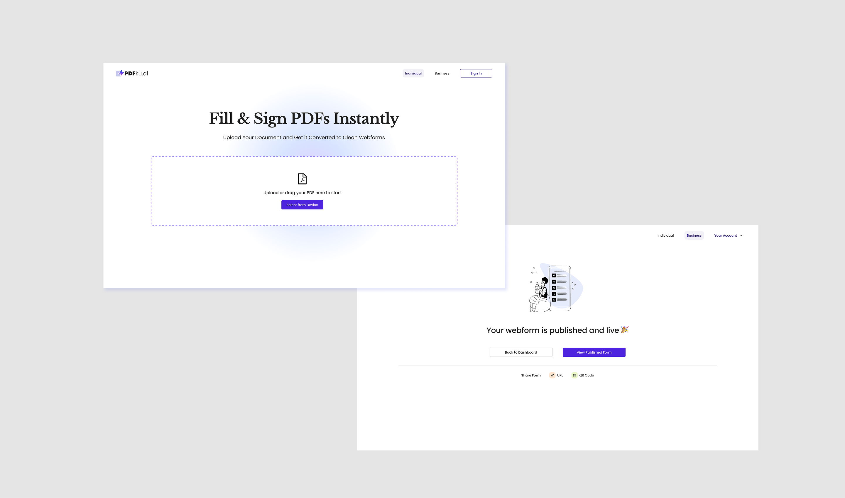
Our goal was clear: be the fastest way to turn a static PDF into a smart, fillable form on any device.

Scoping the MVP and Designing the UX

We began by mapping the core product journey:

  1. Upload a PDF
  2. Highlight fields to turn into simplistic webform
  3. Instantly preview and share the form

To ensure we deliver a focused, scalable product, we scoped our MVP around the core need: turning static PDFs into smart, fillable forms with minimal friction. Our early design prioritized a fast, no-login experience for individuals, and a lightweight but extensible platform for businesses. The following roadmap outlines how we plan to expand from this foundation - gradually layering in AI, form creation tools, and developer access while maintaining a clean, user-first experience.

Product Roadmap

From here, I created a responsive information architecture and defined essential user flows for both desktop and mobile. My design priorities were:

  • Eliminating unnecessary steps to reduce user dropout
  • Designing intuitive field-editing logic with clear visual affordances
  • Avoiding clutter by using progressive disclosure (only show what’s necessary per screen)
Iterations

Low-fi Wireframes

I then sketched low-fidelity wireframes to validate layout and structure, testing a few options for the editor interface and response pages. After review, we moved into mid-fidelity wireframes with more defined UI components and interaction states.

IA of 2B flows

Mobile Wireframes

Desktop wireframes

High-Fidelity Mockups and Launch Preparation

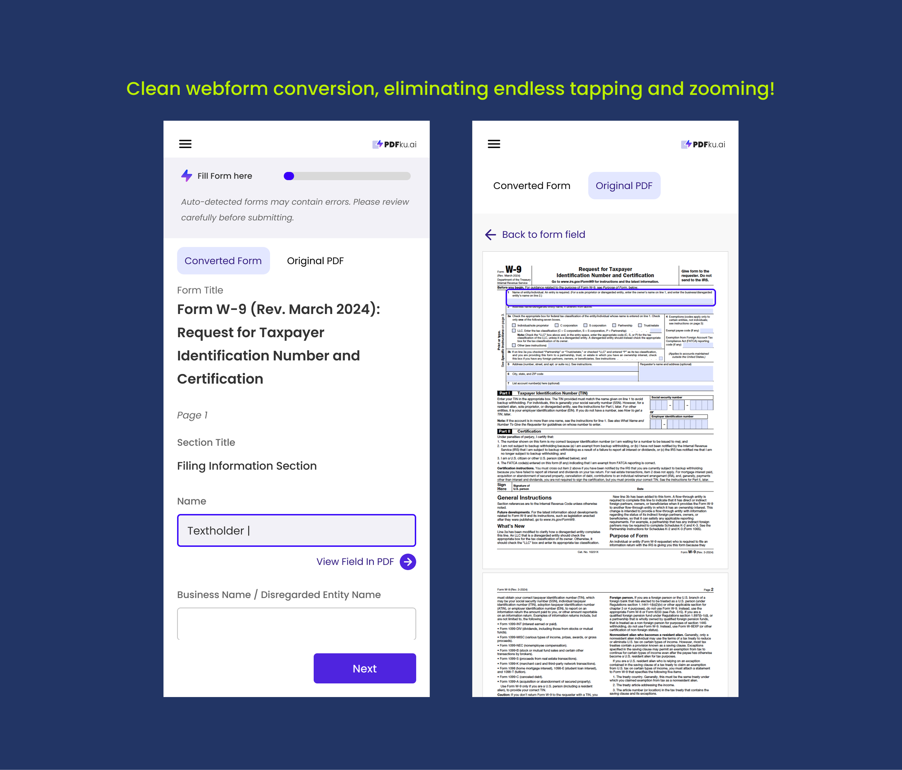
Once the core user flows were defined, I translated the wireframes into high-fidelity mockups using Figma. This stage involved multiple rounds of iteration, especially in refining the PDF editor UI. We focused on improving button hierarchy, mobile gestures for editing fields, responsive empty states, and visual clarity around field types and icons.

A design system was created to unify spacing, buttons, input styles, and error handling—ensuring consistency across the tool while remaining easy to scale.

Design system - typography & color

Design system - Button in responsive sizes

Design system - form field variations

With the product design in place, I shifted to building the marketing site. I created a clean, single-page landing page in Webflow, crafted to clearly communicate the product value and drive conversions. The messaging emphasized speed and simplicity, free to start, and great mobile performance. The site was optimized for fast loading, responsive behavior, and included feature comparisons, clear CTAs, and use-case examples to appeal to both individual users and businesses.

Delivery
The Delivery
Explore the key design highlights from this project, where each feature showcases the thoughtful decisions and creative solutions that shaped the final outcome. Dive in to see how the design evolved and brought the vision to life.
No items found.
No items found.
Result & Impact
Result 🍋
We delivered a functional MVP with responsive design, intuitive field editing, and a lightweight form-sharing flow. The tool supports PDF upload, field placement, and link/QR sharing without requiring user login, and is currently preparing for launch with early testers.
Impact 🌍
The product bridges a clear market gap by offering instant, no-login PDF form conversion—empowering casual users to complete forms quickly, and laying the foundation for businesses to manage submissions efficiently without expensive software.
Takeaways
Learnings 🎓
Designing for both 2C and 2B users pushed me to balance simplicity with scalability. I learned how to prioritize features by phase, work closely with developers to match design constraints, and test UI decisions through rapid iteration.
Influence on My Future Design 🚀
I plan to introduce more intelligent field mapping and AI-assisted form suggestions while continuing to preserve the tool’s minimal UI. Building with long-term extensibility in mind is key—especially for accommodating the roadmap's business dashboard and developer API tools.
"I needed to turn a PDF into a fillable form on my phone—every tool I tried was either too clunky or asked me to pay upfront. PDFkuai let me convert and share my form in under a minute. Super simple and actually mobile-friendly!"

More to read