Vivian's Design Project
Entertainment Event Dashboard
Design Highlights
UX/UI design
Entertainment Tech
My Role
UX Designer (Internship)
Duration
Jan - Apr 2024
Tools
Figma
Why am I doing this project?
I was an intern at Immer and worked on the project within a UX design team of 3 people.
Table of Content
Introduction
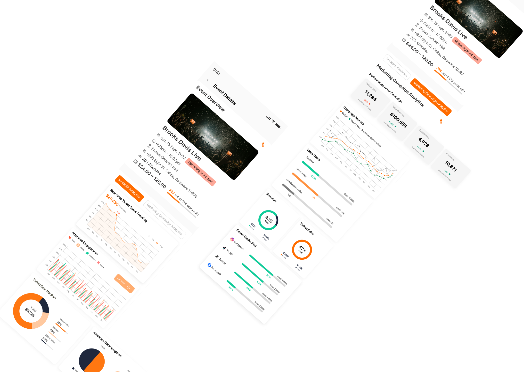
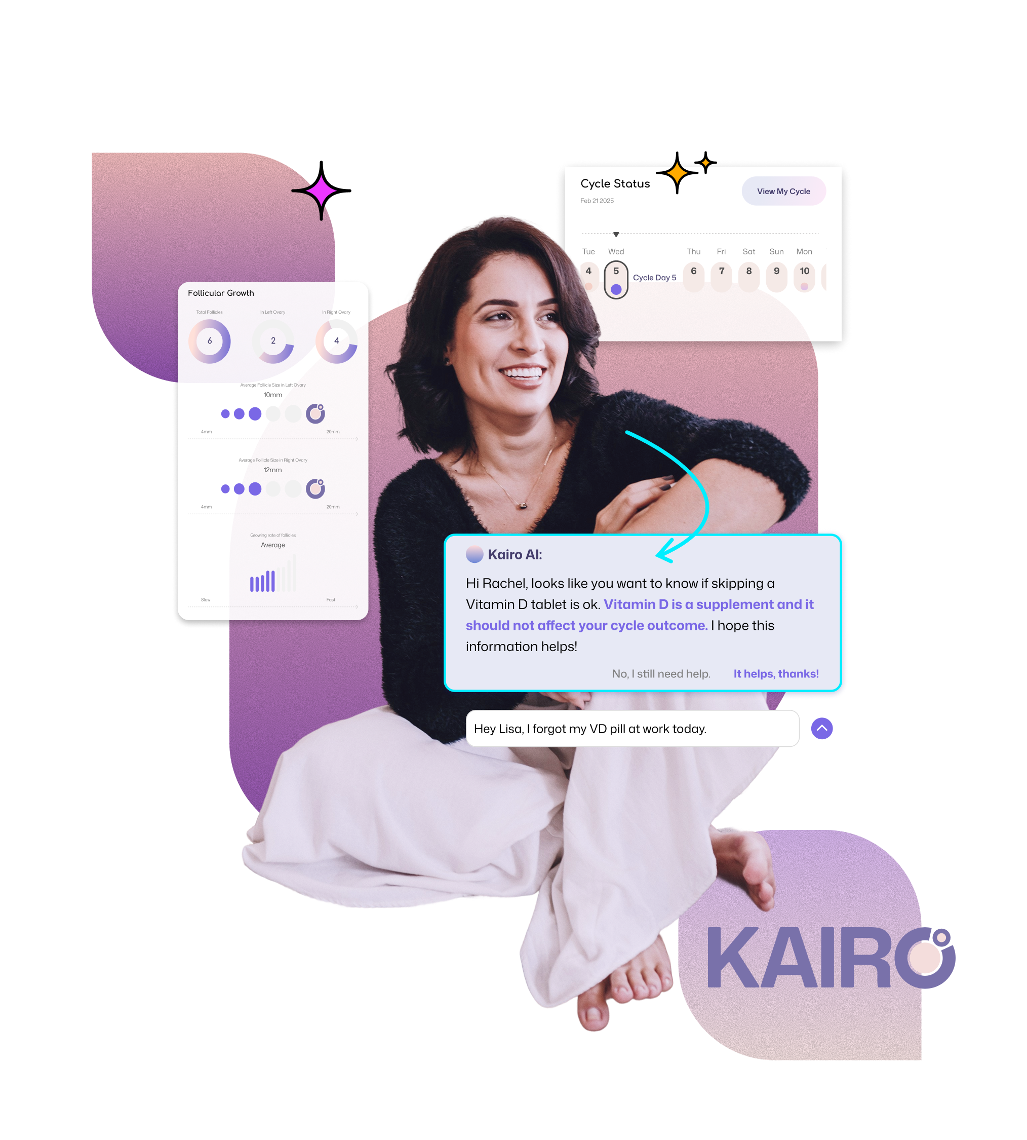
At Immer, I was part of the UX design team, focusing on improving the event detail dashboard and designing the onboarding flow to enhance user engagement. The dashboard provides in-depth analytics and campaign insights for event organizers, ensuring they can track performance and optimize ticket pricing strategies. I also designed a prototype for the onboarding flow, guiding new users through a seamless setup experience to maximize adoption and usability.
Immer is a revolutionary live entertainment platform designed to give artists and event organizers full control over their pricing strategies. Unlike traditional third-party platforms, Immer eliminates restrictive pricing constraints, offering a transparent, flexible, and user-driven marketplace where creators set their own ticket prices ๐Ÿš€.
The Problem ๐Ÿ›‘
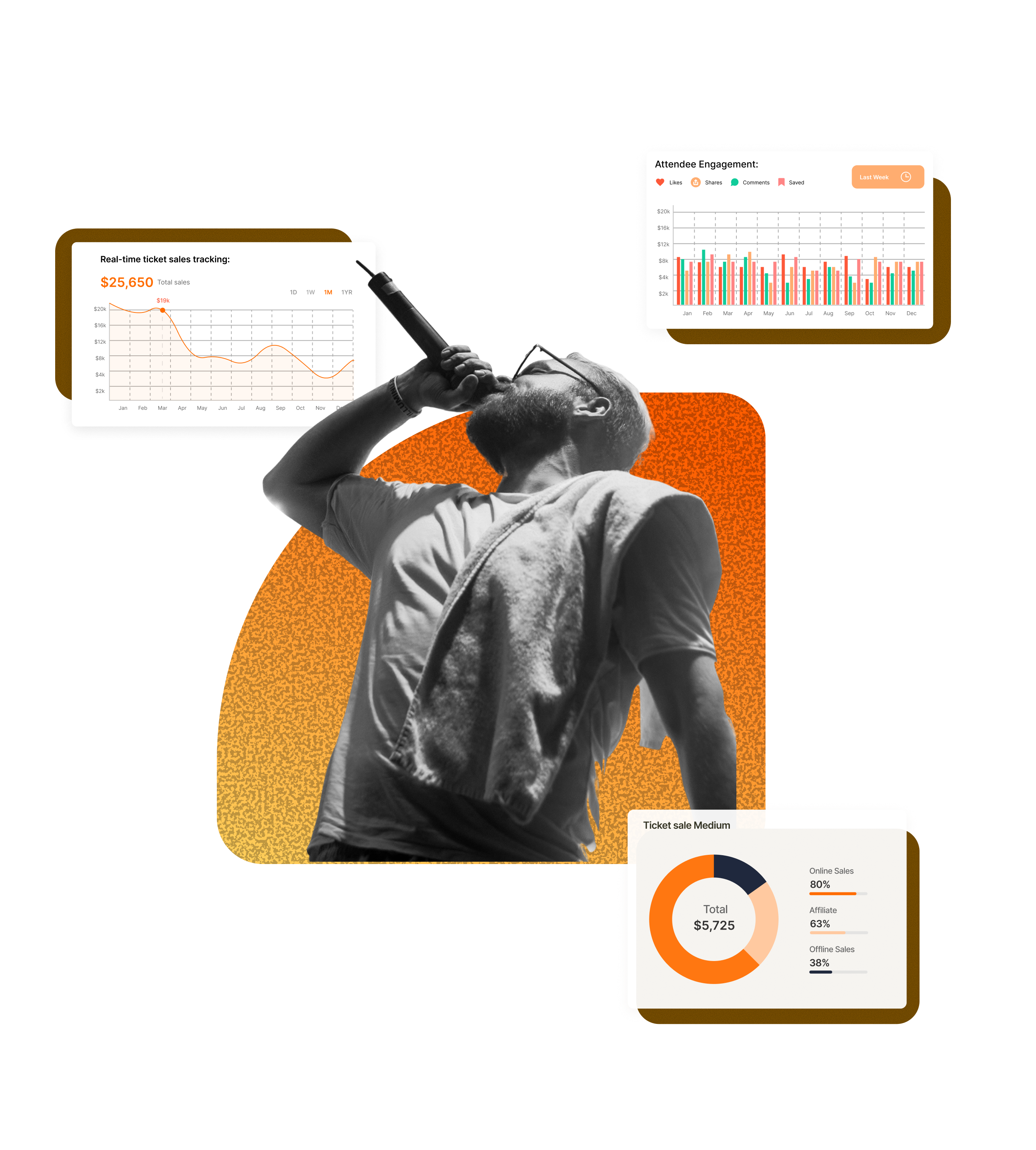
Existing platforms lacked real-time insights, clear analytics, and intuitive tools to help organizers optimize revenue and make informed decisions. Without a centralized dashboard, tracking ticket demand, sales trends, and pricing adjustments was inefficient and fragmented.
My Solution โœ…
Our team designed an event detail dashboard that provides real-time analytics, pricing insights, and performance tracking in a clear, intuitive interface. Organizers can monitor ticket sales, track campaign data, and adjust pricing strategies dynamically based on live data.
Empathizing
Ideating
Iterations
Delivery
The Delivery
Explore the key design highlights from this project, where each feature showcases the thoughtful decisions and creative solutions that shaped the final outcome. Dive in to see how the design evolved and brought the vision to life.
No items found.
No items found.
Result &ย Impact
Result ๐Ÿ‹
The event organizer dashboard and onboarding flow improved usability for event creators, making it easier to manage pricing, availability, campaign and event details. Users could navigate the platform more efficiently, leading to higher event setup completion rates.
Impact ๐ŸŒ
The most significant impact was reducing confusion around ticket pricing dynamics, which was a major friction point. By simplifying information architecture and making pricing clearer, users were more likely to complete event listings and optimize their pricing strategy.
Takeaways
Learnings ๐ŸŽ“
A key takeaway was that onboarding flows should be frictionless yet informative. Too much information can overwhelm users, but too little can cause uncertainty. Finding the right balance is critical for conversions.
Influence on My Future Design ๐Ÿš€
Moving forward, I will prioritize transparent UI elements, clear information hierarchy, and intuitive onboarding in event-based and marketplace platforms. Designing with user confidence and ease of navigation in mind will be central to my approach.
โ‹
"Finally, a fair shot at great seats without the usual ticketing stress!"

More to read