

This mobile UX/UI design projects aims at delivering mid-fidelity screens that let users to experience the AI-powered coaching by their heroes via SMS, Video and Voice Messages.
The goal of this project was to create a user-friendly and intuitive experience by first understanding user needs and structuring the content accordingly. I focused on implementing a seamless mobile interface, refining the user flow and information architecture, and delivering mid-fidelity designs that aligned with both usability and business objectives.

WebApp Review + Team Discussion
The first step to start the design process was to review the WebApp my client had at the moment to understand that features and functionality of the product. The original product representation of the product functionality has minimal design and simple flow, and our goal is to translate these features into clean, intuitive yet informative mobile interfaces.

Pain Points
A meeting with the product team and developer was held after the first review session to understand their capacity of reach. I gained more insights on the core needs of the users and solutions that this product is offering. From this meeting, user pain points were summarized as follow.

Journey Mapping
Following my understanding of users’ struggles, I wanted to experience the product from a user’s perspective to further implement a smooth flow for them to learn about this product. I started a Journey Mapping as follow:

Feature Visualization
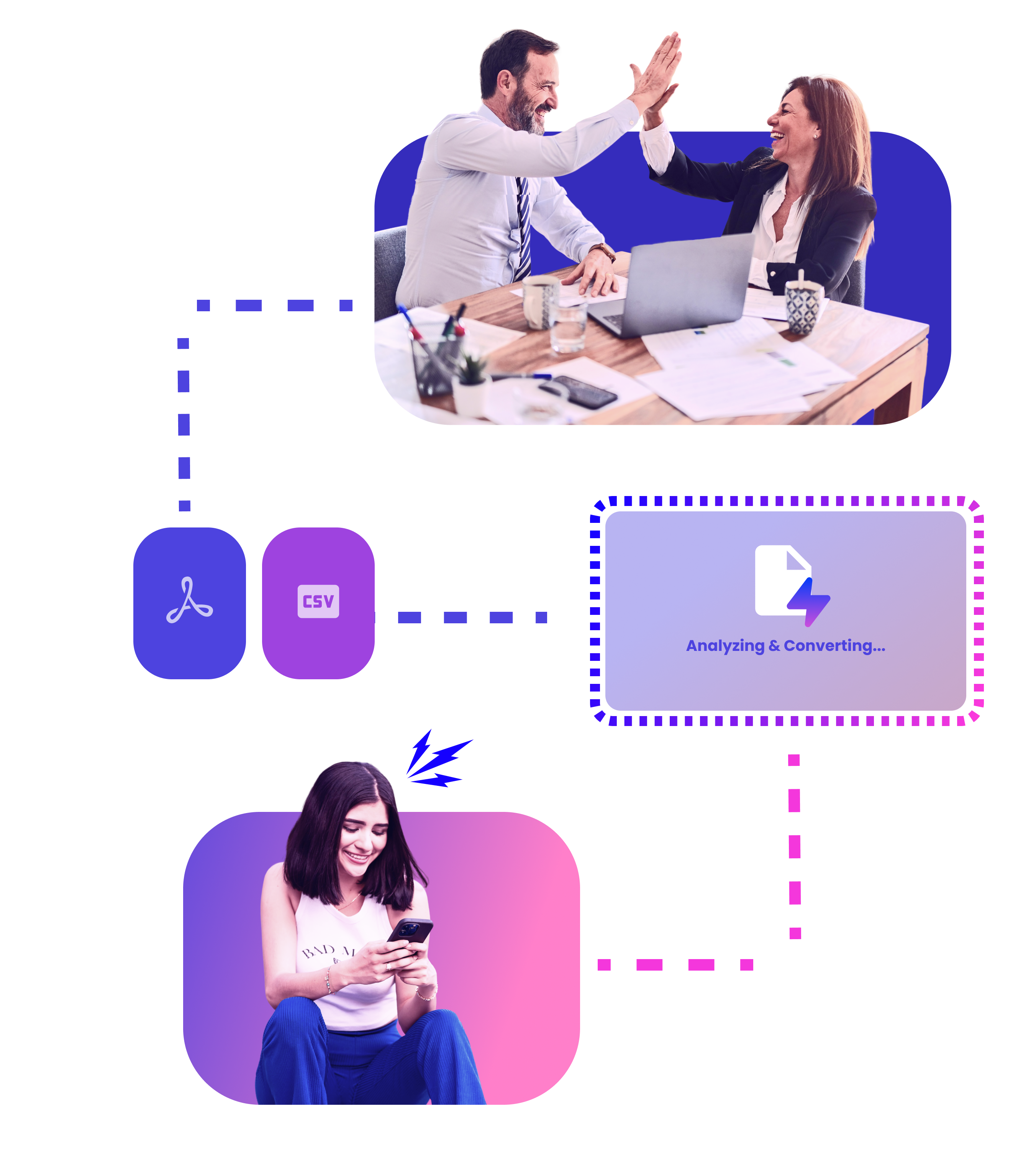
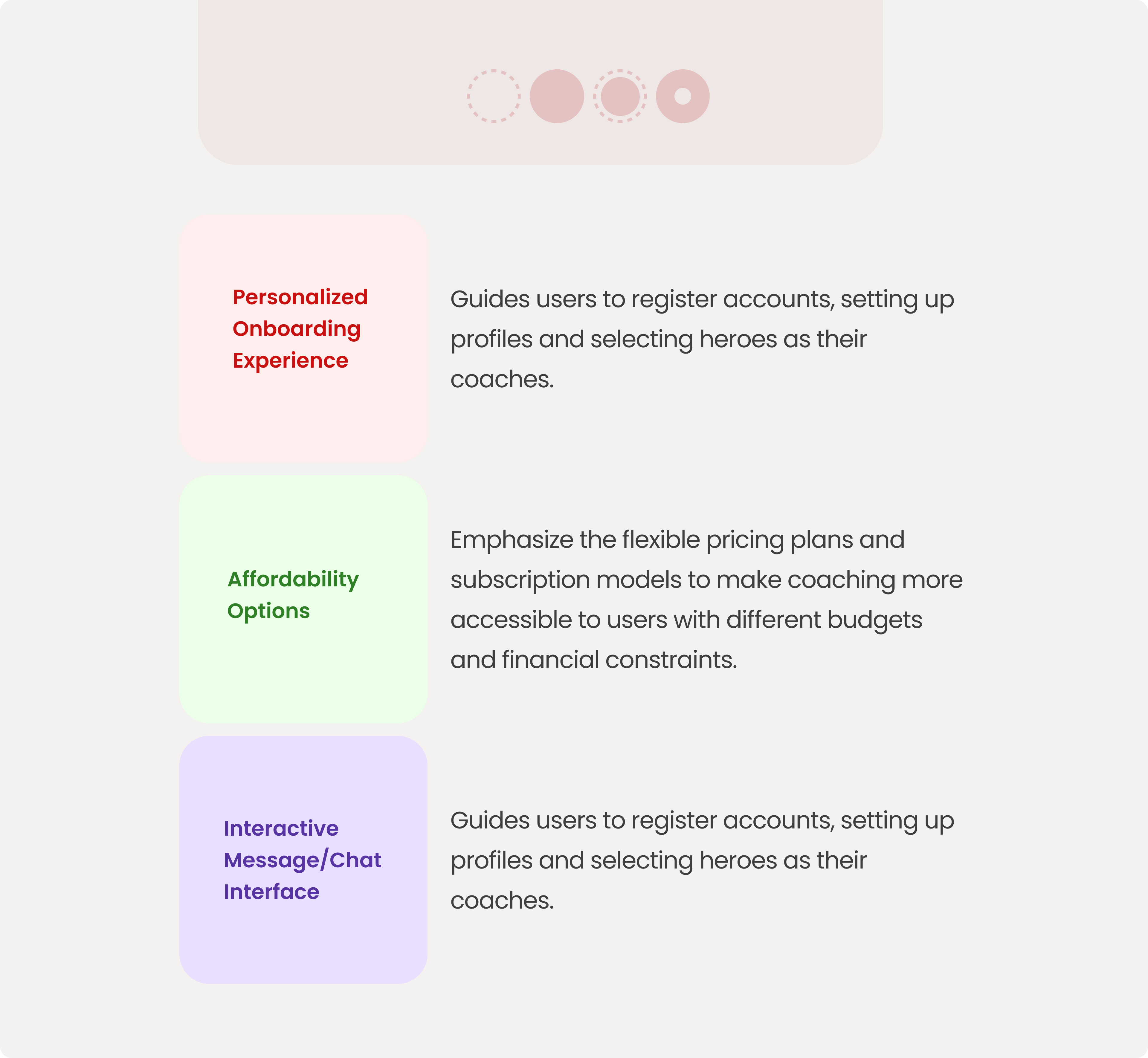
From the previous research on users and discussion with the product team members, we came up a few design ideas on how to structure the app’s flow in response to user’s challenges. Given budget and time constraint, at the moment the app should contain the following aspects:
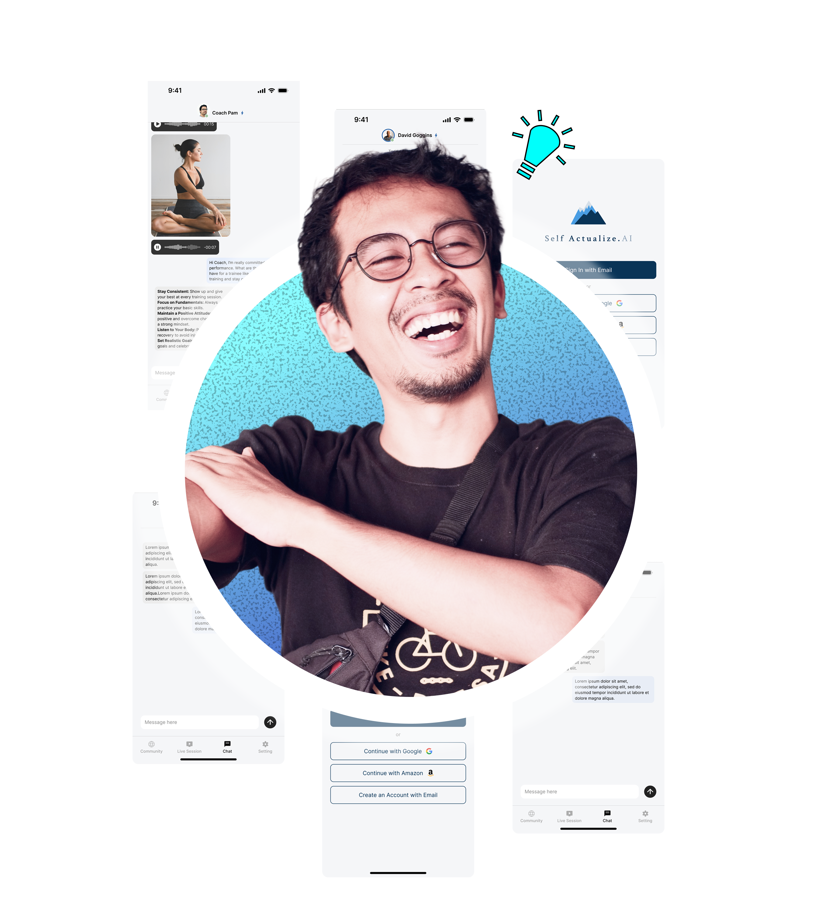
Creating the User Flow for an AI Coaching App
I started by outlining the core steps a user would take—from first opening the app to completing their coaching session. Beginning with the login process, I identified key decisions (like enabling SMS notifications) that could alter the path users follow. Once in the app, they have the option to browse coaches, choose one, and begin a chat-based coaching session.

From there, I integrated the subscription plan decision, allowing users to either continue their plan or explore alternatives. This branching structure ensures flexibility while maintaining a clear, intuitive progression: login → coach selection → chat page → subscription continuation. By mapping these steps visually, I could pinpoint potential friction points and streamline navigation, ensuring users have a smooth and guided experience throughout their AI coaching journey.
We decided to forgo a traditional home page and instead implemented a bottom navigation bar that lets users quickly access core features. The Chat section is central, allowing direct interaction with a coach via text or media messages. From the chat view, users can see the coach’s status and, in later phases, track goals or access past conversations.
For Profile Settings, users can view and update account info, switch or change their coach, and modify subscription plans. This keeps personalization and session management under one clear menu. Additional sections like Live Sessions and a Community forum are planned as next-phase expansions, ensuring we have a scalable IA that can grow while maintaining an intuitive structure.
By focusing on streamlined sections and a concise bottom navigation, users can effortlessly move between chats, profile settings, and future features without getting overwhelmed.

Wireframe Iterations
Due to tight timelines and budget constraints, we had limited opportunities for multiple refinement rounds. Instead, I focused on creating high-impact wireframes that effectively balanced usability and business goals from the start. With a clear structure in place, we moved forward efficiently, ensuring a functional and visually cohesive design within the given constraints.

With the app design process wrapped up—covering user flow, information architecture, and key features—the foundation is now set for delivering a user-centric AI coaching experience. Continue to explore the design in the deliveries!