Vivian's Design Project
Fertility Care Tracking App
Full Case Study
UX/UI design
Healthcare & Wellness
My Role
UX/UI Designer, Product Manager
Duration
Nov 2024 - Jan 2025
Tools
Figma, Procreate
Why am I doing this project?
Being a former medical professional πŸ‘©πŸ»β€βš•οΈ who worked in reproductive health, I deeply empathize with people who need to undergo infertility treatments. It's a mentally and physically consuming process. As working more in-depth with patients, the more motivated I became to design an app that helps with the difficult situation.
Table of Content
Introduction
As the Product Designer & Manager, I created Kairo, an IVF tracking app designed to ease the physical and emotional burdens of fertility treatments. From concept to execution, I led the branding, UX strategy, and design, ensuring a seamless experience for patients.
Kairo is an AI-powered app that helps IVF patients manage treatment tasks and understand real costs. It simplifies injections, appointments, and procedures into clear action steps, while its crowdsourced Cost Finder reveals hidden fees and clinic pricing, empowering smarter decisions and reducing stress.
The Problem πŸ›‘
Patients undergoing IVF often face overwhelming emotional and logistical stressβ€”not only from the complexity of their treatment plans (injections, procedures, appointments), but also from opaque and inconsistent pricing across clinics. Existing fertility apps focus heavily on cycle tracking but overlook the real burden: disjointed records, poor task coordination, and the financial unpredictability that follows failed cycles.
My Solution βœ…
Design an intelligent, patient-centered IVF support app that: Uses AI to simplify treatment logistics, such as injection reminders, appointment scheduling, and record updates. Improves cost transparency through a community-powered database of real clinic costs, helping patients make informed decisions and plan financially with confidence.
Empathizing

Design Process Overview

‍

Design Process

‍

A Quick Intro on Fertility Care like IVF

Fertility care like IVF is a very niche topic. Therefore, before we dive in the design journey, let's have a short 3-min reading of IVF's introduction, quickly understanding the background of this project!

‍

‍

Defining Fertility Treatments and IVF

In Vitro Fertilization (IVF) is a medical process that helps people conceive when natural pregnancy is difficult. It involves stimulating the ovaries to produce eggs, retrieving those eggs, fertilizing them in a lab, and then transferring a healthy embryo into the uterus.

‍

Definition of IVF and Reason for IVF

‍

Why it is a complicated and stressful

While IVF offers hope to many, the process is complex and emotionally overwhelming:

1️⃣ Medical & Physical Strain – Hormone injections, frequent procedures, and side effects like fatigue, bloating, and mood swings.

2️⃣ Emotional Rollercoaster – Uncertainty of success, high stress, and the emotional highs and lows of each treatment cycle.

3️⃣ Financial & Time Burden – Expensive treatments, multiple cycles needed, and frequent clinic visits disrupting daily life.

4️⃣ Mental Overload – Managing medications, appointments, and complex treatment plans, leading to stress and overwhelm.

These challenges make organization, support, and emotional well-being essential for patients undergoing IVF.

‍

Stressors of IVF

‍

A day of IVF patient

‍

Who are we designing for (who are the IVF users)

1️⃣ Egg Donors – Individuals who donate their eggs to help others conceive. They undergo hormone treatments, medical screenings, and an egg retrieval procedure.

2️⃣ Gestational Carriers (Surrogates) – Individuals who carry a pregnancy for intended parents using an embryo created from the intended parents’ or donors' genetic material.

3️⃣ Intended Parents (IPs) – Individuals or couples (including LGBTQ+ families and single parents) pursuing IVF.

‍

Patient-centered design

‍

Now you should have an idea of what kind of product we are talking about in this project. Let's start exploring the story of Kairo!

‍

Secondary Research

This project is designed for individuals undergoing infertility treatments, particularly IVF. Secondary research indicates that the primary demographic falls within the 35–44 age range, with White and Asian adults being more likely to pursue treatment. Due to the high costs, upper-income individuals are more commonly represented, with many relying on health insurance for coverage. To further illustrate user needs, this case study will introduce two personas developed from user research insights.

‍

User Demographic

‍

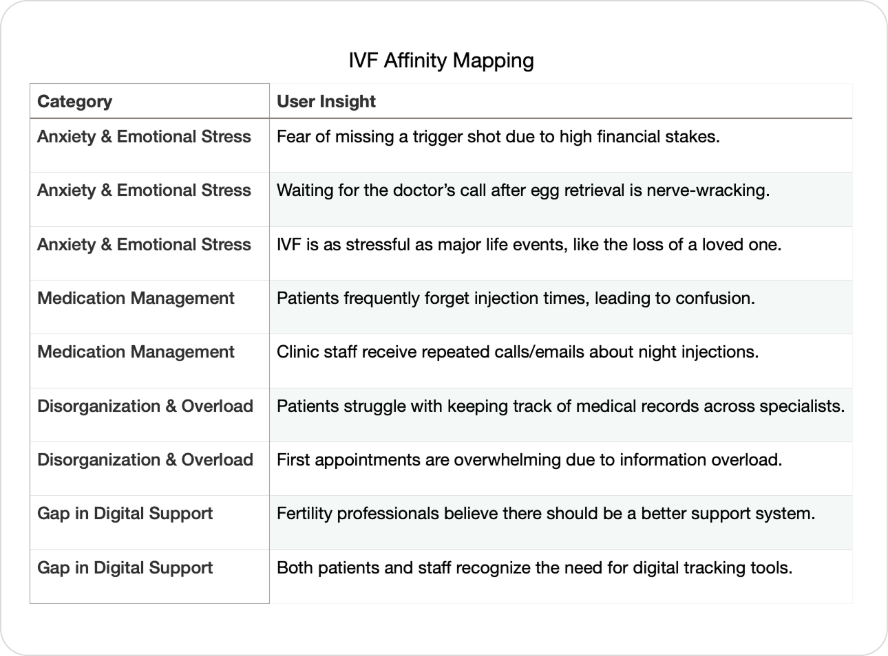
Studies have shown that undergoing IVF can be as stressful as major life events, such as the loss of a loved one. An NIH study highlights IVF as a psychologically and emotionally taxing process for patients.

‍

Psychological Research on IVF Patients

‍

From my experience as a former healthcare professional in fertility care, I witnessed firsthand the profound physical and mental strain patients endure. Beyond societal and familial pressures, the stress is compounded by the intense time commitment, frequent clinic visits, and emotional toll. With numerous intricate steps in a single treatment cycle, IVF is a long, complex journey that demands significant effort from patients.

‍

‍

User Interview: Gathering Insights from IVF Stakeholders

Creative Recruiting Process

Recruiting users for such a sensitive topic posed a challenge. To address this, I leveraged my professional network and reached out to a former coworker at a fertility clinic, who connected me with someone actively working with IVF patients. This creative problem-solving approach allowed me to gain valuable medical staff insights while also securing a firsthand patient perspectiveβ€”giving a well-rounded understanding of user needs.

‍

The Interview

Due to time and resource limitations, I conducted two in-depth user interviews to gain firsthand insights into the challenges of IVF treatment.

1️⃣ Interviewee 01 – Female, 33 years old, fertility clinic staff

  • Works directly with new IVF patients daily, managing their care and guiding them through treatment.
  • Provided insights into the most common patient struggles, frequently asked questions, and recurring pain points she observes in her role.

2️⃣ Interviewee 02 – Female, 42 years old, experienced IVF patient

  • Has undergone multiple IVF cycles, offering a personal perspective on the emotional and logistical challenges of treatment.
  • Shared how she navigated past difficulties, what solutions helped her, and what support she wished she had during the process.

Each interview lasted 30-45 minutes, covering treatment pain points, emotional stressors, and areas where digital tools could offer better support. These insights directly influenced the design decisions in this project.

‍

Interviewees

‍

Affinity Mapping + Pain Point Findings

To better analyze the insights gathered from my user interviews, I conducted an affinity mapping exercise to identify key themes and recurring pain points. By organizing feedback from both an IVF clinic professional and an experienced patient, I was able to pinpoint the most critical challenges faced during the IVF journey. These themes guided my design decisions, ensuring that my solution directly addresses the most pressing user needs.

‍

Affinity Mapping from Interview

‍

1️⃣ Patients Face High Levels of Anxiety & Stress

  • Fear of mistakes: Missing an injection, especially the trigger shot, is a major concern due to the financial and emotional stakes.
  • Waiting for medical updates is nerve-wracking: Patients feel heightened anxiety while waiting for doctors’ calls, particularly after critical procedures like egg retrieval.

‍

2️⃣ Medication Management Is a Major Pain Point

  • Patients frequently forget injections: Despite thorough instructions, many still reach out at night asking for guidance.
  • There’s a need for better support tools: Even fertility staff recognize that an improved system for reminders and instructions could reduce confusion.

‍

3️⃣ The Process Is Overwhelming & Disorganized

  • Patients must repeatedly request medical records: Those seeing multiple specialists struggle with record transfers, adding extra stress.
  • First appointments are information-heavy: Patients are overloaded with details, making retention difficult. A structured, easy-to-access digital resource could improve recall.

‍

4️⃣ There’s a Clear Gap in Digital Support

  • Fertility professionals feel current support systems are lacking: Even clinic staff believe there should have been a better tool long ago to assist both patients and providers.

‍

Interview Findings

‍

‍

Persona &Β Journey Mapping: Put myself in the shoes

To ensure my IVF tracking solution meets real user needs, I created two personas representing a new IVF patient (Emily) and an experienced IVF patient (Rachel).

‍

Emily - New to IVF

‍

Rachel - Experienced

‍

I then mapped out their treatment-phase journey from starting IVF to the end of a cycle, identifying key pain points:
βœ” Medication tracking challenges – Confusion over injection schedules and reminders.
βœ” Emotional highs & lows – Anxiety around procedures, wait times, and results.
βœ” Information overload – Struggling to retain clinic instructions and treatment details.

‍

Journey Mapping Data

‍

Comparison of Rachel and Emily's Journey

‍

Inspired by conducting persona and journey mapping, I have a more clear vision towards the product:

  • Personalized medication & appointment tracking – Reduces stress around injections and scheduling.
  • Clear, digestible information – Helps users navigate complex medical steps with ease.
  • Emotional support features – Provides reassurance through community and progress tracking.

‍

‍

Competitive Analysis

To design an effective IVF tracking solution, I conducted a competitor analysis to identify feature gaps and opportunities for innovation. This research focused on both direct competitors (IVF-specific apps) and indirect competitors (general fertility trackers).

‍

Key Competitors Analyzed:

  • Embie – IVF/IUI tracking with medication reminders and community support.
  • Glow & Clue – Strong cycle tracking, but lack IVF-specific features.
  • Ovia & Flo – AI-powered cycle predictions, yet limited treatment tracking.
  • Femia & SART Mobile – Emerging IVF-focused solutions but with usability gaps.

‍

Competitor Analysis

‍

Affinity Mapping Insights:

  • Personalized IVF Tracking – Users need structured tools for medications, injections, and appointments.
  • AI & Data Insights – Predictive analytics could enhance treatment planning.
  • Better UI & Navigation – Reducing complexity for an intuitive experience.
  • Financial & Emotional Support – Addressing cost tracking and mental well-being.

‍

Affinity Mapping Competitor Insights

‍

Insights from Competitor Analysis
Ideating

‍

Ideating Solutions

‍

Structuring the Product: User Flow

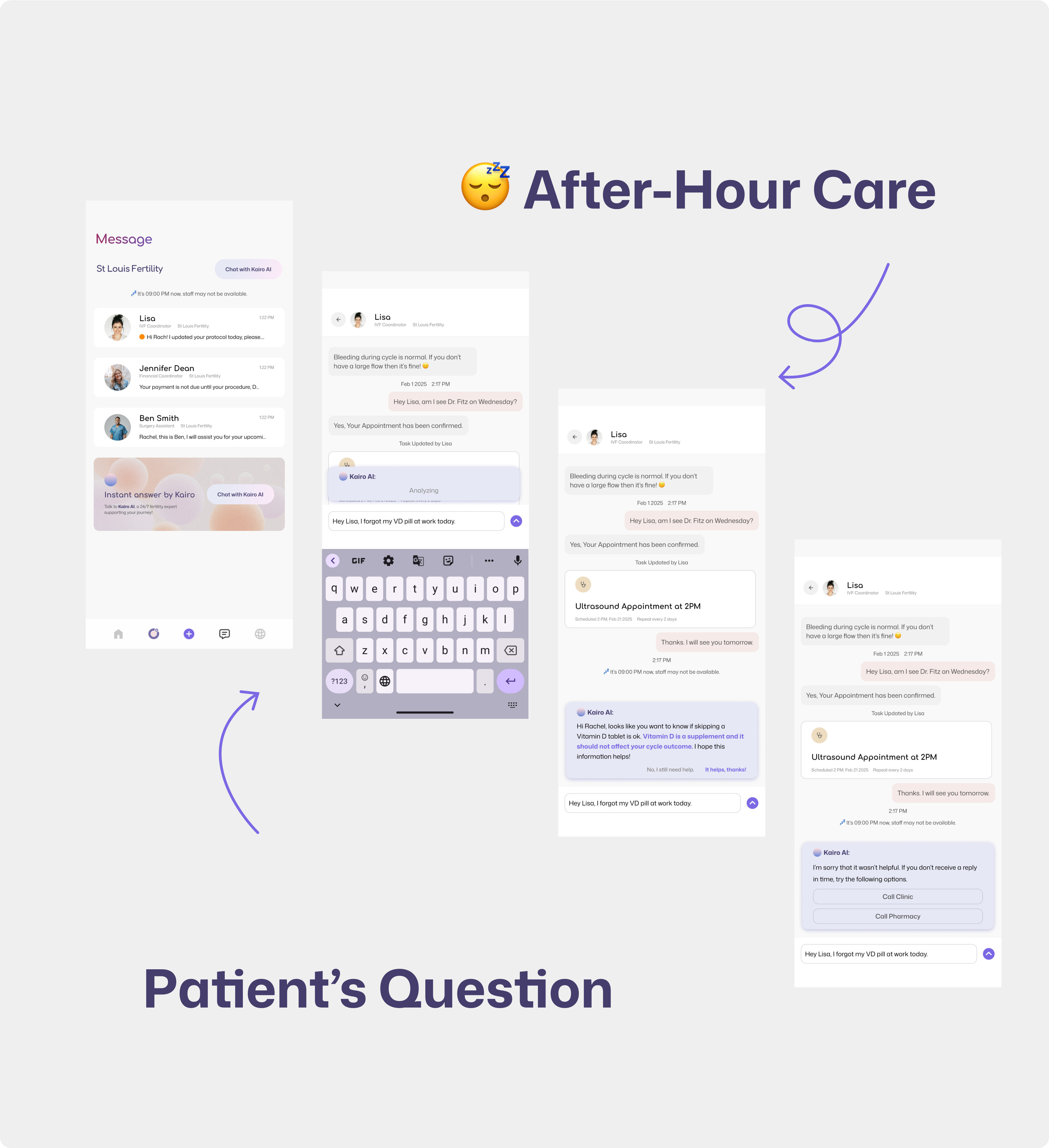
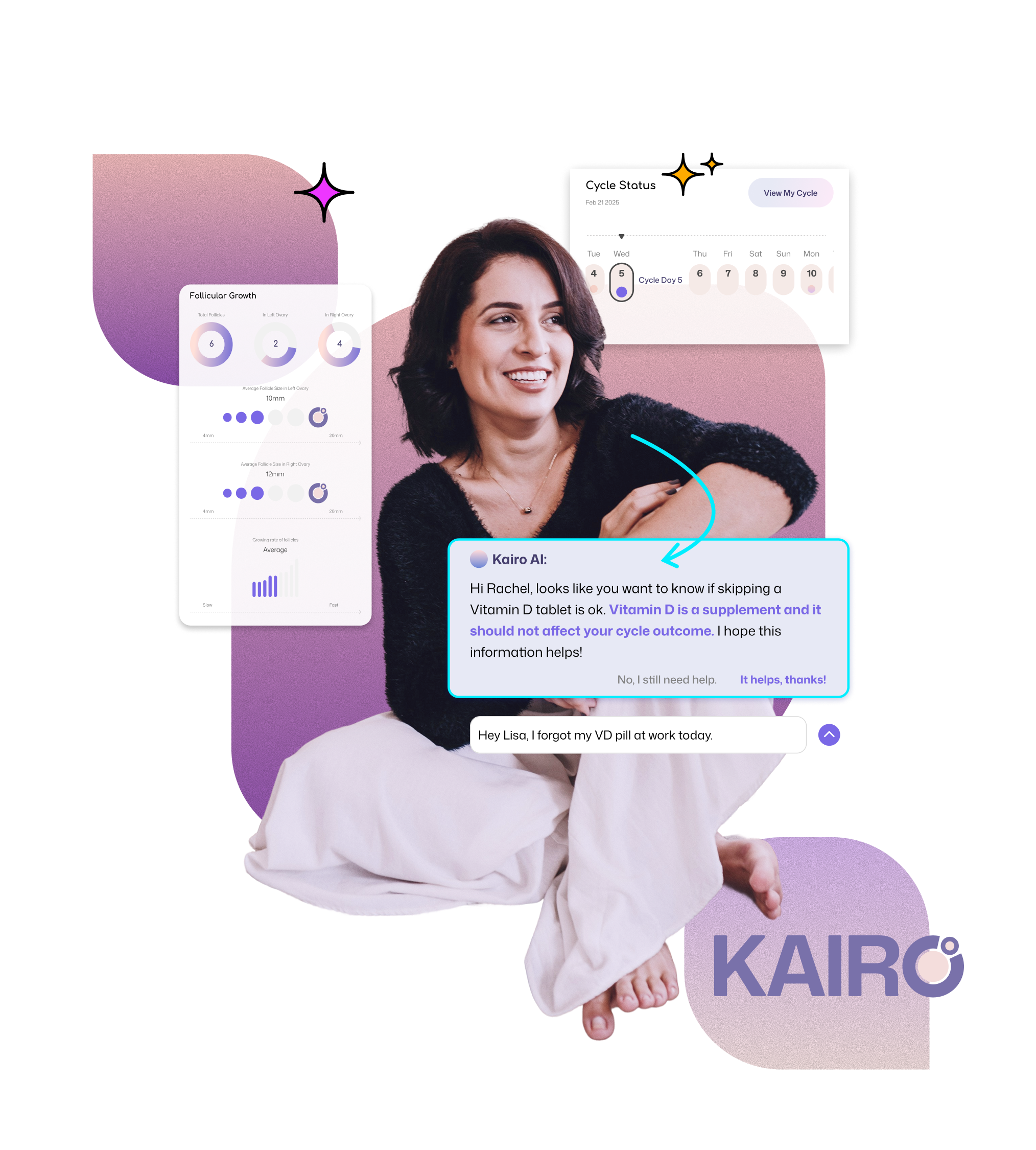
To create a seamless IVF tracking experience, I designed a structured user flow that guides patients through their treatment while integrating clinical communication and task automation.

  1. Create/Update Cycle - Users begin by logging a new IVF cycle or updating an ongoing one, ensuring all treatment details are recorded.‍
  2. Message from Clinic & Auto-Generated Tasks – When clinics send updates (e.g., medication changes, appointment confirmations), the system automatically generates actionable tasks for the user.
  3. ‍Completing a Task with Helpful Resources – Users mark tasks as complete while accessing educational content, video guides, or reminders to ensure correct execution (e.g., administering injections properly.)‍
  4. Determine Action by Document-based smart recognition – User can upload or input medical documents, allowing OCR & NLP to extract key details, which they can then review, edit, and approve for automated cycle updates or manually adjust, ensuring accurate fertility tracking even with non-affiliated clinics.

‍

Create / Update Cycle

‍

Message from Clinic & Auto-Generated Tasks

‍

Completing Task

‍

Smart Recognition

‍

Information Architecture

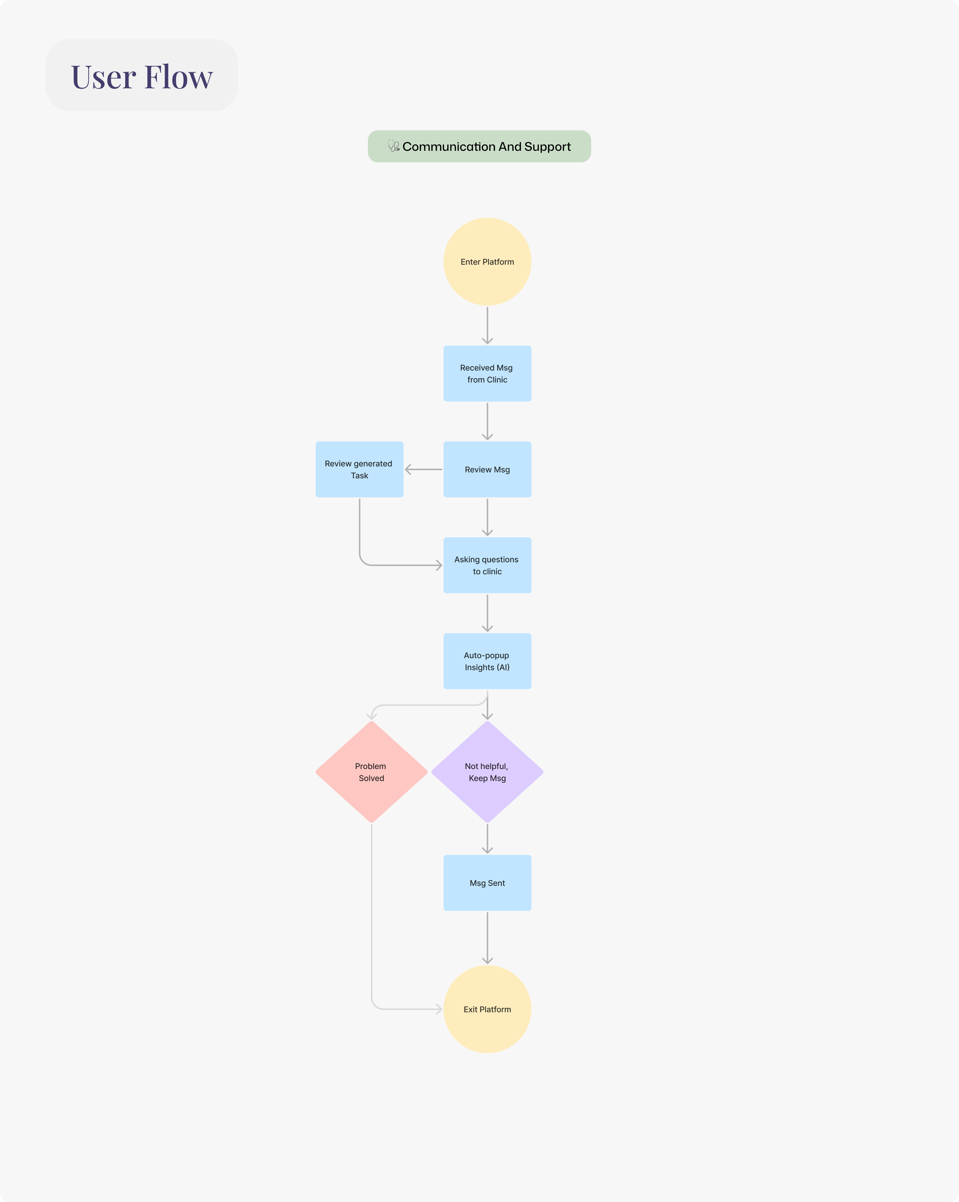
The app structure prioritizes clarity and accessibility, organizing features into intuitive categories:

  • Home Dashboard – Overview of cycle progress, upcoming tasks, and important updates.
  • Cycle Tracker – Detailed breakdown of medications, appointments, and treatment stages.
  • Clinic Messages – Secure inbox for provider updates that seamlessly integrate into the task system.
  • Task Reminders – Completing treatment tasks.
  • More features like communities, file organization, medication inventory, etc.

‍

Information Architecture

‍

My Inspirations on creating the key product features:

βœ” Automates treatment tracking – Reduces manual input and human error.
βœ” Keeps communication organized – Ensures clinic instructions don’t get lost in emails or paper handouts.
βœ” Provides real-time support – Helps patients complete tasks with confidence, reducing anxiety.

By combining automation, structured workflows, and intuitive IA, this design supports a stress-free, well-guided IVF journey for patients.

Iterations

Wireframes: Translating ideas

Paper

To ensure a user-friendly and intuitive IVF tracking experience, I started the design process with low-fidelity paper wireframes, followed by digital wireframes in Figma to refine structure and layout.

I sketched multiple layouts to explore different user flows and test how key featuresβ€”such as cycle tracking, task automation, and clinic messagingβ€”should be structured.

‍

The goal was to establish:

βœ” Clear hierarchy – Ensuring patients can quickly access important updates.

βœ” Minimal cognitive load – Simplifying navigation to reduce stress and confusion.

βœ” Task-driven design – Prioritizing auto-generated tasks and medication reminders.

‍

Paper ver

‍

Digital

I translated these sketches into digital wireframes, refining layouts based on:
βœ” User flow alignment – Ensuring a seamless transition between cycle tracking, tasks, and clinic communication.
βœ” Scalability – Structuring the IA to accommodate future feature expansion.

‍

Part of Wireframes

‍

Low-Fidelity Testing

The objective of a low-fi testing is to ensure users can quickly complete tasks, check messages, and update their cycle with minimal effort and confusion.

‍Testing Process:

βœ” Participants: IVF patient and clinic staff familiar with treatment workflows.
βœ” Tasks:‍

  • Complete a task with resource
  • Check for new messages from the clinic and seek for support
  • Update Cycle from messages from the clinic

βœ” Metrics Observed:

  • Time taken to complete each task.
  • Ease of identifying and using shortcut buttons.
  • User feedback on layout clarity and feature accessibility.

‍

Low-fi Usability Testing

‍

Key Findings:

βœ… Task completion improved with embedded resources – Users found it helpful to access instructions or guides directly within task screens.

βœ… Clinic messages needed better organization – Some users struggled to locate relevant updates, leading to UI adjustments for clarity.

βœ… Cycle updates required a more intuitive flow – Users expected a direct option to update treatment details from within message notifications.

‍

Reality Check: Validating the Idea with IVF Communities

To validate Kairo's concept, I turned to IVF communities like Reddit to hear directly from patients. I expected them to care about tracking and reminders β€” but instead, I learned their real frustrations were much deeper.

  • Financial stress: Unclear pricing, hidden fees, and surprise costs were top concerns.
  • Lack of support: Patients felt alone, emotionally and mentally, with little help from clinics.
  • Clinic communication failures: Confusing protocols, poor updates, and unclear add-on charges.
  • Success rates and uncertainty: Many felt misled about their real chances of success.

The biggest surprise was realizing that tracking and reminders weren’t addressing these deeper pain points β€” they wanted clarity, transparency, and emotional support.

‍

Expansion: Cost Finder and Clinic Comparison

With those insights, I pivoted from just cycle tracking to focus on cost transparency and clinic comparison β€” features that give patients real, actionable information.

  • IVF Cost Finder:
    • Breaks down full treatment costs step by step (consult, meds, retrieval, transfer).
    • Adds regional price data and common add-ons (e.g., PGT, ICSI).
    • Helps patients anticipate full costs, not just base prices.
  • Clinic Comparison:
    • Side-by-side clinic pricing, including what patients actually paid.
    • Success rates by age group, to set realistic expectations.
    • Common add-ons and extra fees made visible.

By pivoting to cost and clinic transparency, Kairo now addresses real patient pain points - helping them plan financially, compare options, and make informed decisions.

Delivery
The Delivery
Explore the key design highlights from this project, where each feature showcases the thoughtful decisions and creative solutions that shaped the final outcome. Dive in to see how the design evolved and brought the vision to life.
No items found.
No items found.
Result &Β Impact
Result πŸ‹
From usability study, the IVF tracking app improved medication adherence, significantly reducing missed doses and helping patients stay on track with their treatment. Users found it easier to monitor cycle progress, leading to higher engagement and a stronger sense of control over their fertility journey.
Impact 🌍
This project explores the potential impact of an automated yet flexible tracking system that integrates collaboration with fertility care providers. Through AI-powered updates and task generation, Kairo is designed to adapt to various clinical workflows while keeping the patient experience personalized. Although still a conceptual MVP, Kairo aims to test how technology can reduce patient burden and improve transparency in fertility care.
Takeaways
Learnings πŸŽ“
This project taught me the importance of continuously validating assumptions and designing beyond surface-level solutions. Through real patient feedback, I learned that what people say they need and what they actually struggle with can be very different. Instead of focusing on tracking and reminders alone, I learned to listen for deeper, systemic frustrations, like cost transparency and lack of emotional support. This experience reinforced the value of designing with empathy, flexibility, and a willingness to pivot when real needs emerge.
Influence on My Future Design πŸš€
Moving forward, I will focus on designing tools that give patients more control, transparency, and emotional support. In FemTech and HealthTech, accessibility and flexibility are essential, but so is recognizing the emotional weight of treatment. I hope to explore ways to create a supportive and engaging community space that helps patients feel less alone in the process.
❋
"Navigating fertility treatments felt overwhelming, but this app made it so much easier."

More to read